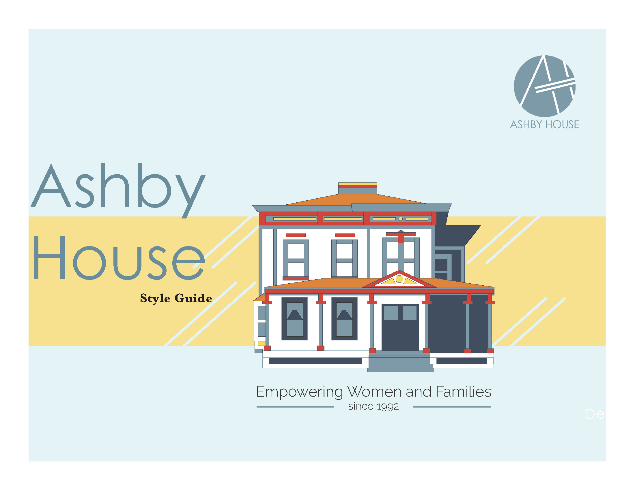
Ashby house
Branding | identity Design
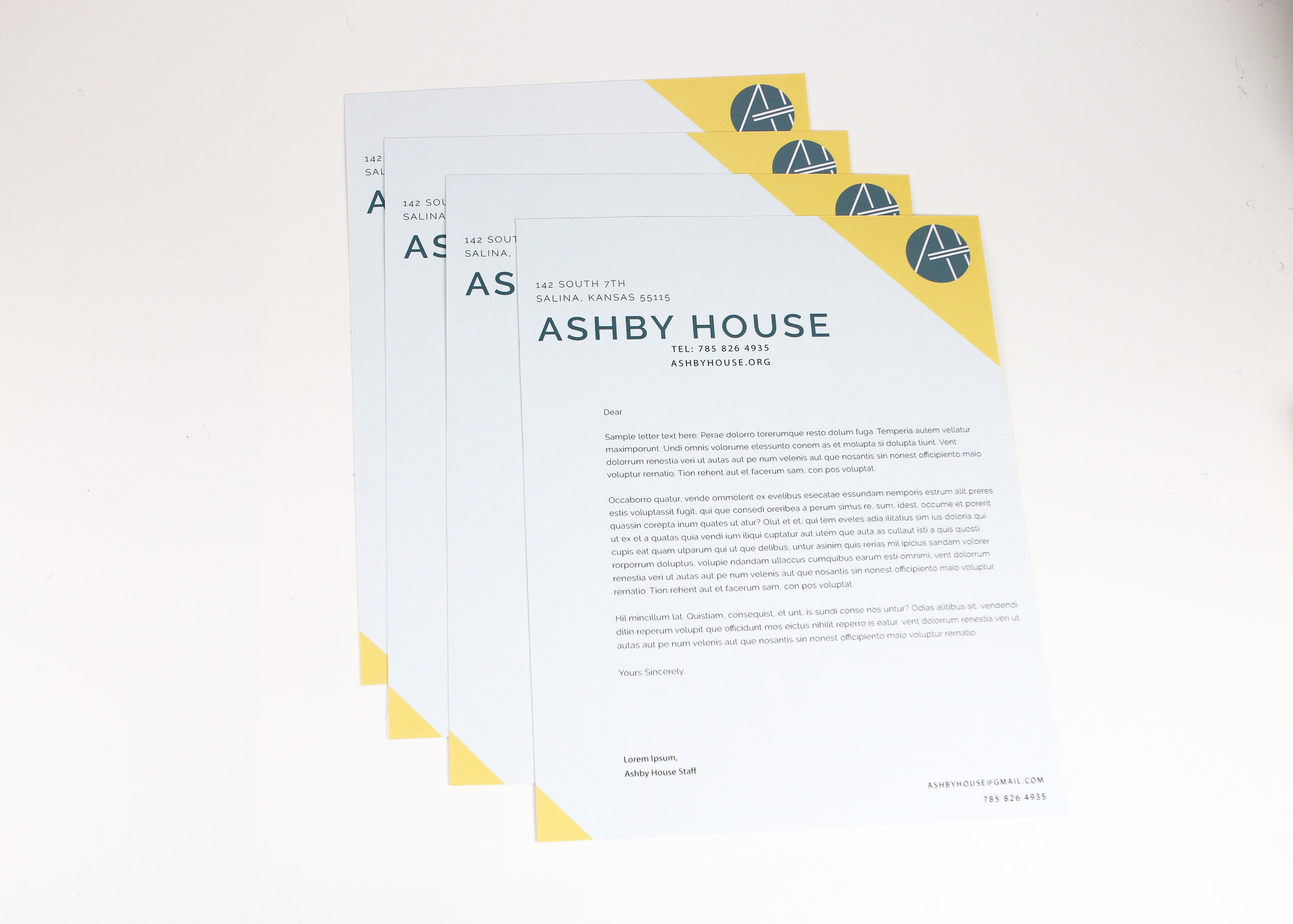
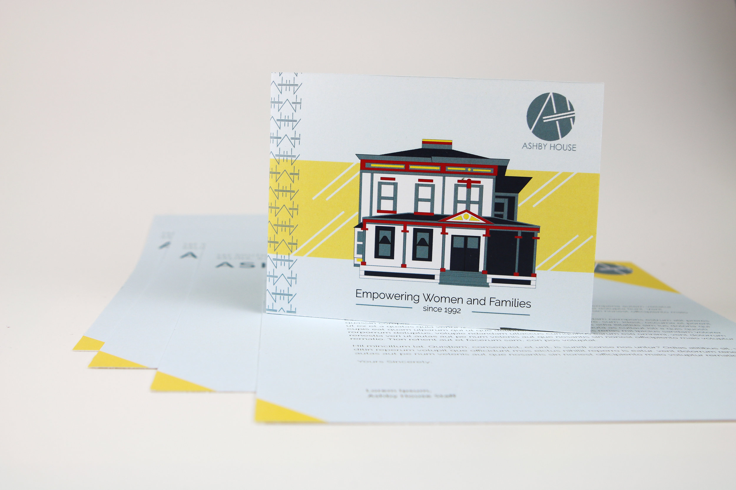
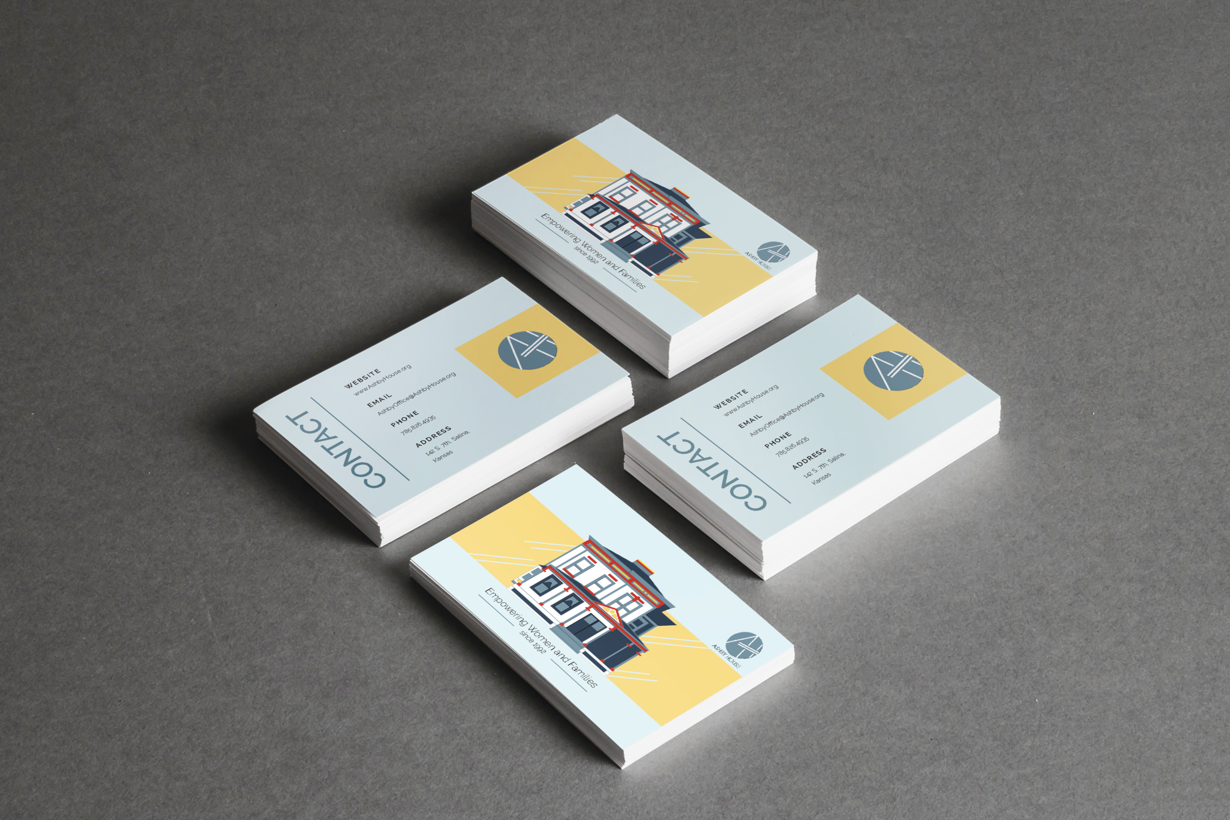
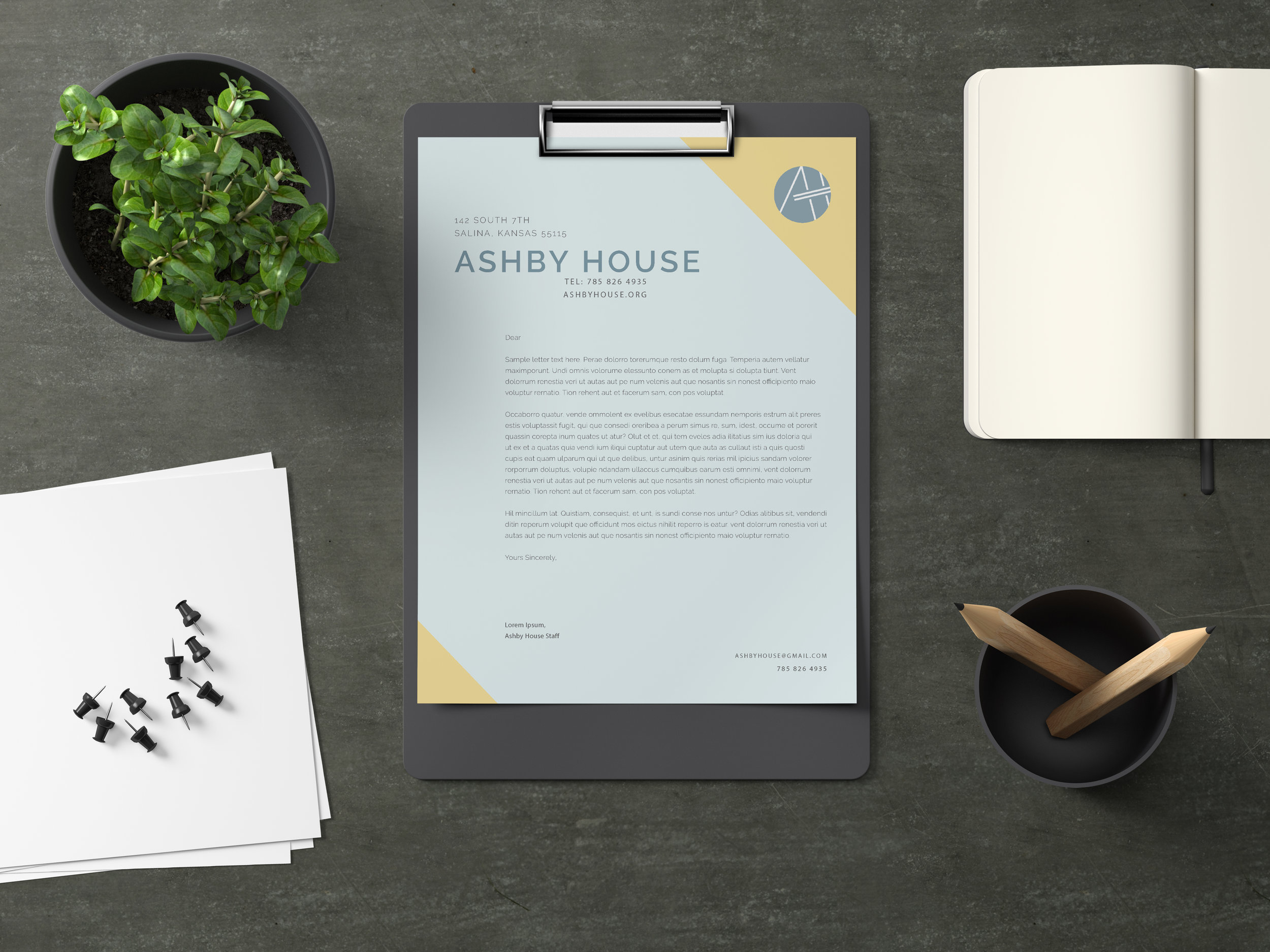
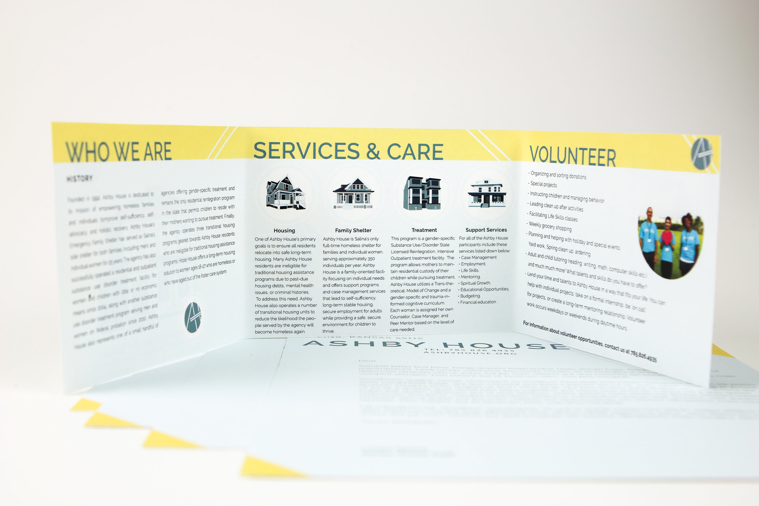
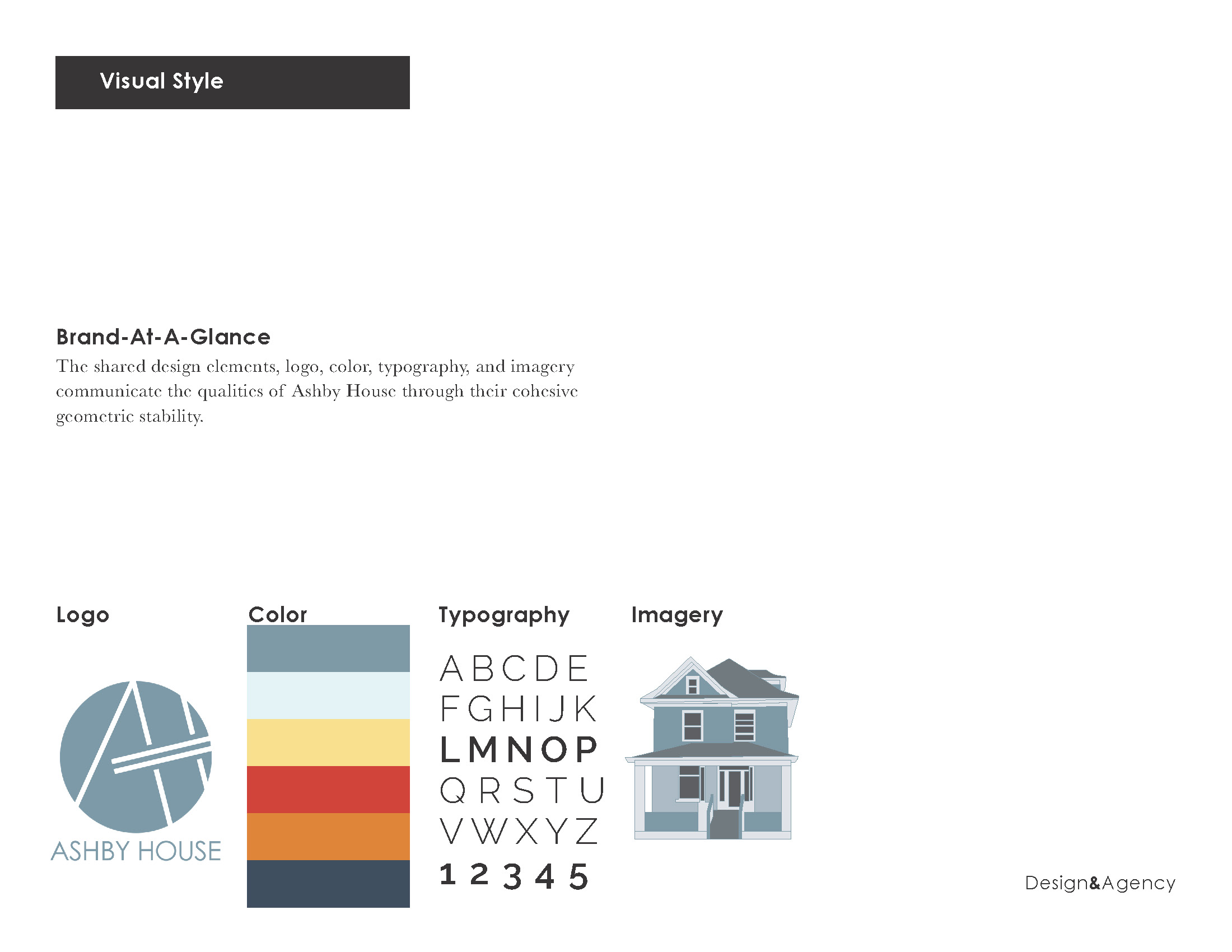
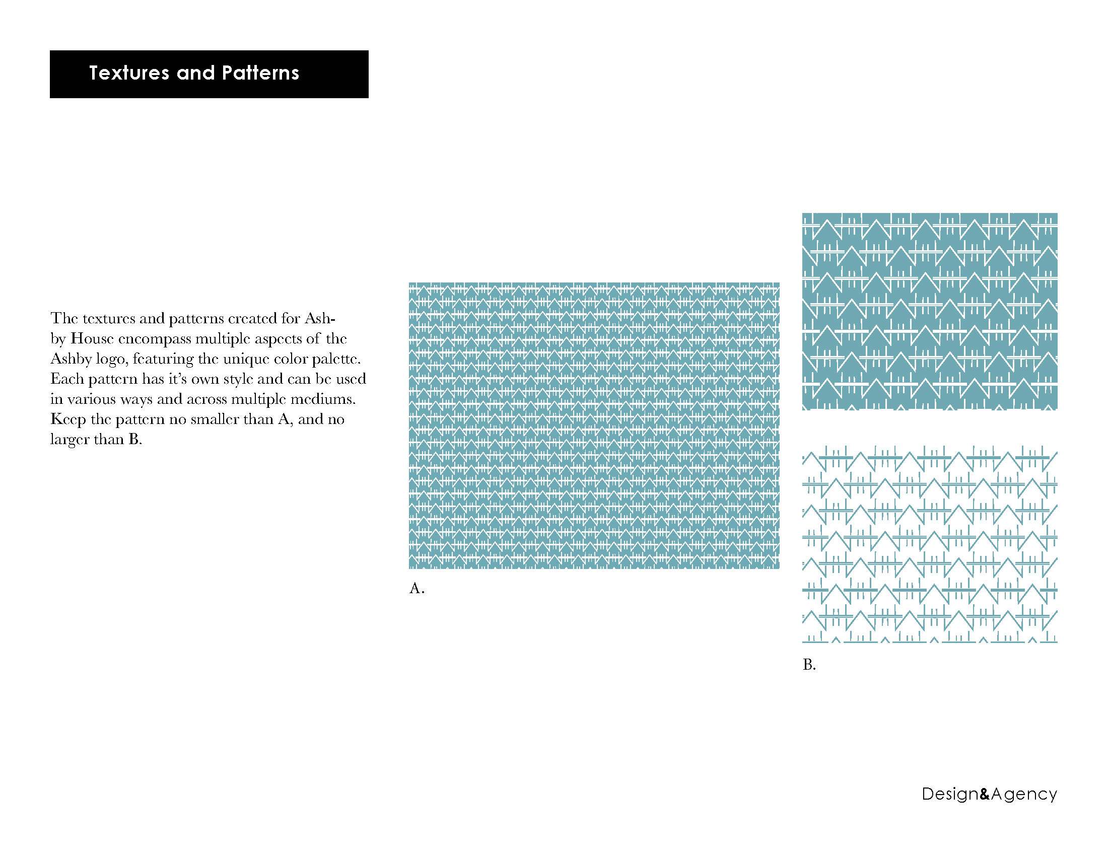
Part of our goal while rebranding Ashby House is to convey an uplifting sense of community and home. A spectrum of muted and dark blues complemented by a sunny yellow is both calming and friendly. The iconic Ashby homes are brought to life with simple line work illustrations. It then has the complementary pattern circles back to connecting with the community. The goal was to show the human touch that this organization brings to the world.
![[FINAL]AshbyBannerMockup (2).jpeg](https://images.squarespace-cdn.com/content/v1/58d2ba96579fb38b801b5402/1556744296063-45T2J8V02SSXPRMH3P52/%5BFINAL%5DAshbyBannerMockup+%282%29.jpeg)